The Prompt Atlas: a map of everything people ask an AI game maker to build
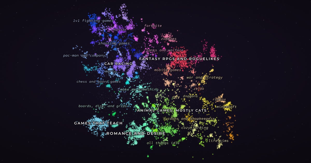
TLDR: People type what they want into Rosebud's create box, and Rosebud builds it. We took a sample of those prompts from earlier this year, thousands of them, unedited, in whatever language and condition they arrived, and made a map where every star is one real request and similar requests sit close together. I'll spoil the ending: the first version of this map was beautiful and wrong, the fix came from a 2017 paper, and there is an island of office chair racing.
The rule
We committed to one constraint before writing any code: we don't touch the text. No translation, no spellchecking, no cleanup. If someone typed "maike me a 2d bus simulator with a ticket system and a route planer," that's what you'll read when you click that star.
The typos, the ALL CAPS, the Portuguese, the entire pygame files pasted into a one-line text box: that texture is what demand for games actually looks like when nobody's watching. Run the data through a cleanup pipeline and what you end up studying is mostly the cleanup pipeline.
There is one exception and it isn't a principled one. The extract caps every prompt at 500 characters, so roughly 9% of them stop mid-sentence, and the pasted-source-code stars are only ever showing you their first paragraph. The median prompt is 152 characters, so most of the map never touches the ceiling, but the ceiling is there.
The first map
You know the recipe. Embed the texts, run UMAP, color the clusters, post the pretty picture. We did that with paraphrase-multilingual-MiniLM-L12-v2 and it worked on the first try: crisp islands, plausible neighborhoods. We were maybe an afternoon from shipping it.
Then came the spot check. We clicked a prompt asking for an Elden Ring style game and opened its nearest neighbors, expecting soulslikes. The top match was about Pokémon.
I stared at that for a while. The second match was also Pokémon. The model wasn't lost; it had keyed on the template. Both prompts have the shape "make me a game like X with Y and Z," and to this model that shared shape was worth more similarity than anything X or Y contained. Our beautiful map was grouping requests by how they were phrased.
The model that survived contact with our data was bge-m3: retrieval-tuned, 1024 dimensions, genuinely multilingual. We use that one embedding space for everything downstream: neighbors, clusters, layout.
The "make a game" problem
Here's a sanity check worth running on any embedding space before you trust it: take random pairs of texts and average their cosine similarity. Unrelated texts should score near zero. Ours scored 0.47.
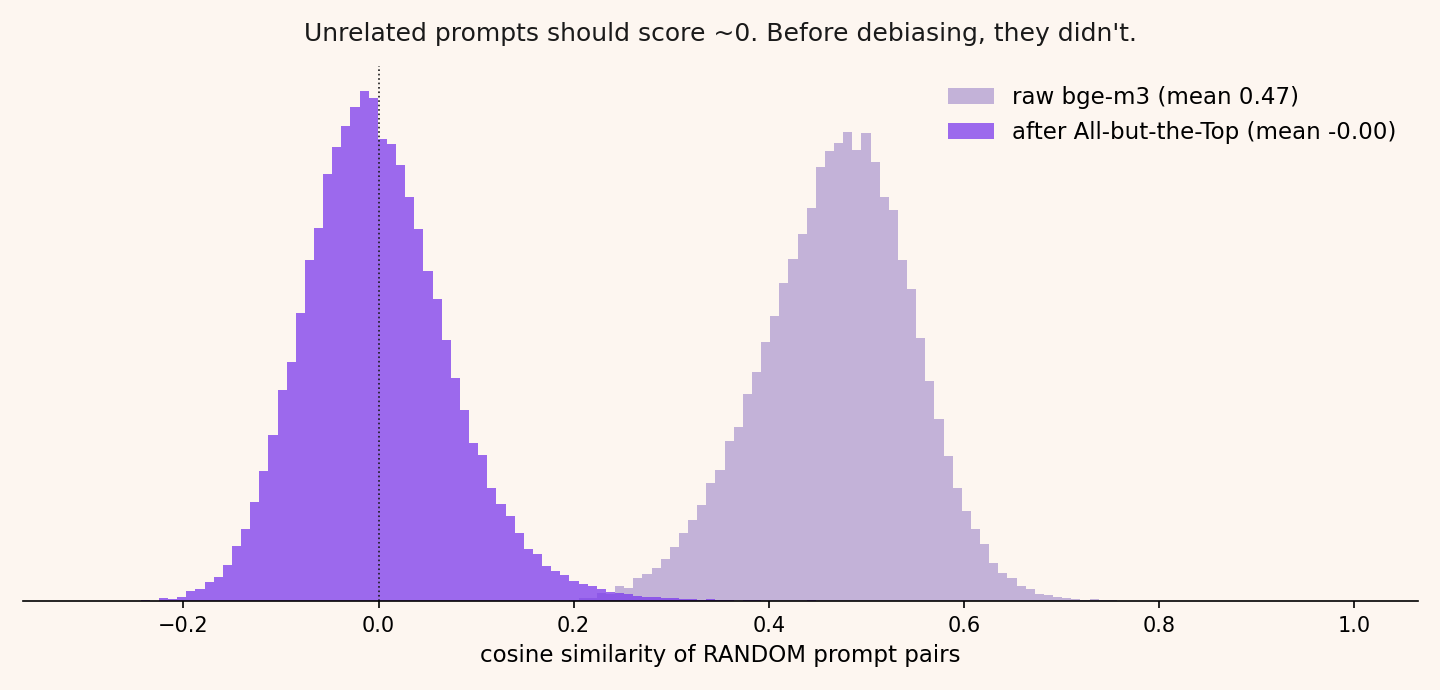
The cause is embarrassing in hindsight. Nearly every prompt contains some variant of "make/create a game," so every vector shares one enormous common direction, and that direction dominates the geometry. Any two prompts look moderately related for the same reason any two letters that open with "Dear Sir or Madam" do.
The fix comes from a 2017 paper called All-but-the-Top: subtract the corpus mean, strip the top principal components, keep the rest. We removed the top two. Random pairs went from 0.47 to 0.00 (the histogram shows the whole distribution snapping into place), and every neighbor list on the map got better in a way you could feel while clicking around.
It also broke everything downstream that had a similarity number typed into it, which was more places than I expected. Cosine in the debiased space doesn't sit on the old scale, so the thresholds deciding when two prompts count as related left most stars sitting alone, and the fixed cutoff we used to sanity-check cluster cohesion started failing 87 of 101 clusters. Nothing threw an exception. The map just got quietly worse in two places while the pipeline reported success. Both numbers are now derived from each build's own distribution, which is where they should have come from before we started moving the space around underneath them.
Two dimensions
A 2D projection of a 1024-dimensional space throws away almost everything, and UMAP is specific about what it keeps: local neighborhoods survive, global arrangement is close to arbitrary. Our early maps had flappy bird prompts in five different places and two shooter islands separated by an island of cat games. Nobody could look at that and be told "distance means similarity" with a straight face.
So UMAP keeps its job locally (island shapes, who's inside what) and loses it globally. Island positions come from two semantic axes: guided versus open-ended, and relaxed versus intense. We first tried scoring those axes from the prompt text and watched flappy bird come out "relaxed," since the words in flappy bird prompts are adorable and the game is a torture device. The scores now come from LLM agents judging what each cluster's game plays like rather than what its prompts read like. The axes drive the layout and are never drawn in the UI, because drawing them would advertise precision that two dimensions don't have. They are one projection out of many we could have picked, and two numbers cannot place a hundred genres correctly against each other. They only have to produce an arrangement worth flying around.
Clicking a star is where the projection's remaining distortions would start lying to individual users, so the interface follows one rule: never draw a line the map can't back up.
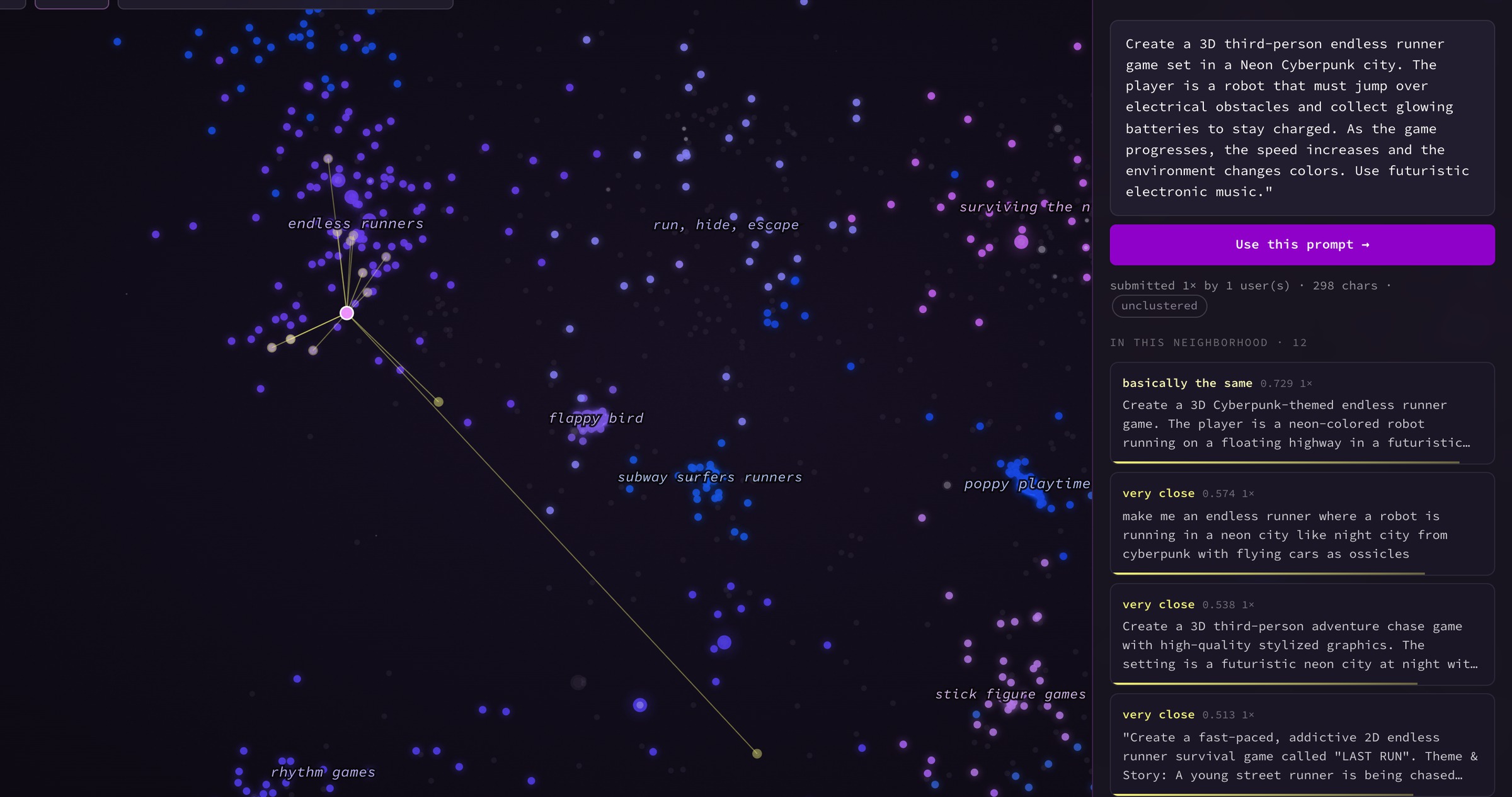
Click a star and you get edges only to neighbors that are similar and also actually nearby. A strong match that UMAP exiled to the far side of the galaxy shows up in a separate list, labeled "same idea, elsewhere," with a button that flies you over. The similarity numbers also get translated on arrival, since raw cosine means nothing to a human (quick: is 0.504 close?). The panel says "very close," calibrated against this corpus's own distribution, and keeps the raw number next to it for the skeptics.
Naming the islands
Clustering is the boring part done the boring way: HDBSCAN over a 5-dimensional UMAP, the BERTopic recipe, about a hundred clusters out. The auto-generated names were things like "city / builder / build." So we had LLM agents read each cluster and write real titles, and the detail that mattered was making them read each cluster's edges, not just its core. The core of a cluster is easy. Labels die at the edges, where the stragglers live.
For genuinely mixed clusters the tempting move is a hedge like "mostly racing." We refused the hedge, demoted about a thousand borderline prompts back into unclustered dust, and let the remaining islands keep confident names, which a second wave of agents then re-verified against fresh samples.
This is the stage where the map stopped being a chart and started being a place:
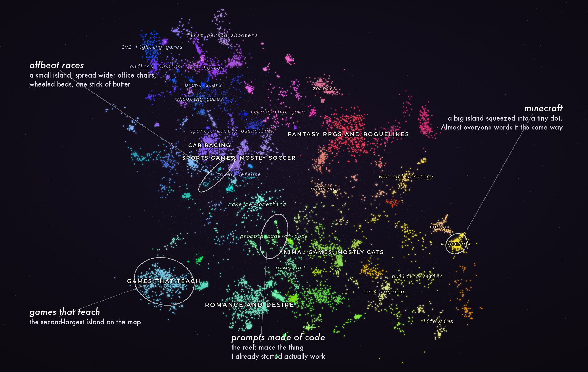
There's an island of races between office chairs, wheeled beds, and one stick of butter (largely a Brazilian genre, we learned). An island of story games about escaping the guillotine in revolutionary Paris. A reef of prompts that are just pasted source code, because "make this thing I already started actually work" is demand too. And an island for a meme genre that did not exist a year ago; internet culture shows up in this data within days.
And yes, there is a large, thriving continent labeled romance and desire, and no, not all of it is hand-holding. Anyone who has met the internet saw this coming. The volume is still its own data point about unmet demand. (My personal favorite, quoted in its entirety: "penis mario game." Three words and it's a complete design document. Please don't type it into Rosie, she won't generate it for you anyway.) The explicit specimens on the map render as [prompt hidden]; the island keeps its size, you're just spared the details.
Privacy
Three layers. The map is anonymous by construction: no usernames, no IDs, only the text, with emails masked automatically. On top of that, LLM agents read every prompt, all of them, and flagged anything pointing at a person: real names, contact details, self-identifying statements, links that lead back to an author. We ran that pass twice, the second time on the final payload right before release. Hundreds of prompts had their text hidden as a result. Their stars stay on the map so the density stays honest, but they render as [prompt hidden — privacy/content review]. And if someone finds their own prompt and wants it gone, there's an email address on the page; removal is one message.
The second agent pass is the one that earned its keep. It caught a prompt crediting its author by name on the game's loading screen, a request specifying a real license plate for the game's car, and links to requesters' own projects on other platforms. None of that matches a regex, and all of it identifies somebody. Language models turn out to be good at noticing when a text quietly points back at its author.
Implementation notes
The atlas has no backend. A 0.7 MB HTML shell, a ~3 MB gzipped JSON blob, a storage bucket. The rendering is a hand-written canvas engine; there is no framework because there is nothing for a framework to do.
Two implementation details survived enough iterations to be worth passing on. The camera flies on the smooth zoom-and-pan trajectory from van Wijk & Nuij, 2003, the zoom-out-glide-dive you know from Google Earth. We degraded it twice by adding an easing curve on top, because adding easing curves to camera motion is standard practice. Here it's exactly wrong: the path is already parameterized for constant perceived velocity, and easing it again compresses all the travel into a nauseating mid-flight whip. The correct amount of additional easing is none. The paper is twenty-three years old and it beat us twice.
The other one is about the frame budget. The starfield is static in world space, so redrawing ~35,000 canvas primitives on every panning frame is pure waste. We render the world once into an oversized offscreen buffer and slide that around, repainting only when the view outruns the buffer's margins. Panning on a throttled CPU went from roughly 20fps to a flat 120, courtesy of a trick older than some of our users.
One more button ties the map back to the product. Every star is a real request, so the panel has Use this prompt: click it and Rosebud starts building that game. Some of these prompts have been waiting since earlier this year for somebody to press it.
Caveats
Things I'd want to know before quoting any of this back at someone:
- It's a sample from one export window earlier this year, not everything anyone has ever typed at us. Proportions move with whatever the internet is doing that month; the meme island above is the obvious example, and it may be gone by the time you read this.
- Prompts are clipped at 500 characters, so about 9% of the text on the map ends mid-sentence.
- Identical prompts collapse into one star, which carries how many times it was sent and by how many people (the panel shows both, and star size follows the count). Near-identical prompts do not collapse. "make a flappy bird" and "make a flappy bird game" are two stars.
- Roughly 45% of the stars are in no cluster at all. HDBSCAN calls them noise and we left them that way instead of forcing everything into an island, so every island's size is a floor rather than a count.
- The island titles and both layout axes are LLM judgments, re-checked by other LLMs. That's a real improvement on "city / builder / build" and it is not the same thing as being correct. If a label matters to your argument, click into the island and read the prompts, which is the whole reason they're on the page.
- You can't audit the privacy pass. Behind each [prompt hidden] is our claim that there was a name or a phone number or a link in there, and you have to take it.
Findings
The first two pull in opposite directions. A handful of fantasies cover most of the volume: driving fast, being scared, cozy blocks, dragons. Meanwhile almost nobody words the same fantasy the same way twice, which is why keyword analytics kept failing us and why this map needed to exist at all.
The clone prompts also deserve a closer read. People ask for "minecraft" and "GTA" constantly, but the actual text is asking for a feeling: endless building, a city to run wild in. The brand is just the shortest pointer anyone has to that feeling, which is convenient, because the brand is the one part we can't ship.
And a third one that this post is deliberately not going to settle. Everything here is demand for making a game. We also see what people choose to play, and those two maps do not overlap nearly as much as you would expect them to. The thing someone wants to build and the thing that same person wants to sit down and play are frequently not the same thing at all, which is an uncomfortable finding if your job is building tools for the first group. Working out where the two diverge needs a second dataset and its own post. That one is next.
The atlas is here. Take the tour, or just click stars. The office chairs are in the lower half.